If a website is the new shop window, Facebook is the fliers you push through people’s letter boxes.
When done right, you’ll capture attention and build brand awareness which will lead to sales.
But have you designed the perfect flier that gains new clients? Or are you just wasting paper as your fliers end up as kindling that winter? I’m here to make sure it’s the former.
Follow the five steps below to maximise your Facebook Page’s impact and turn more eyes into customers!

Download your free Facebook Upgrade Worksheet!

Make your Facebook Page name searchable
As a social media manager, you have no idea how frustrating it is to be crafting an awesome Facebook post, only to try tagging another page in it and being unable to find them by simply typing their name.
It’s my job to hunt that page down and tag them, but are most of your customers going to put in that extra effort? I’m going to hazard a guess and say not.
No one is going to remember what your handle (the @name) is, any more than you remember anyone else’s. So, your Facebook Page name has to be intuitively searchable.
Whenever you try and tag someone, you tend to start typing their name as you know it, right? So what is your business’ name, as it is commonly known? If people want to tag you quickly, what are they going to start typing?

Those are the keywords you need at the beginning of your Facebook name and at the beginning of your handle. I know it’s not always possible getting the perfect page name, but your customers aren’t going to spend too much time searching around for you.
For example, as soon as people start searching @nancy e, my profile and page both come up as options. And @NancyEMediaCoach is my handle because @NancyEMedia (which I use on Twitter and Instagram) wasn’t available. It was important to put the add on – in this case, the word “coach” – on the end of the handle because of the way people search and tag. I’m @NancyEMedia on all social platforms, and that’s how people will search for me.
So, how are people going to search for you and your business? The first words they put in should be the first words in your Facebook Page name and handle. If you need to adapt it because your preferred option is unavailable, put any add-ons on the end of the name. If there is more than one option, consider the variation of the name and handle, like I’ve done above.
The key is to think like your customer and make it super easy for them to tag you!
Want some support, feedback and your own business-squad to bounce ideas off? Join our Women’s Business Accelerator ???? For Female Entrepreneurs Who Hustle.

Make your Facebook Page’s profile picture recognisable
For most businesses, this is super simple. Just use your logo!
Don’t try and be fancy by showing off a product or a photo you’re proud of. Your logo is the essence of your brand and should make it super easy to recognise your page, especially when customers are searching for it (see above).
Strong branding is so important and you should absolutely have a square version of your logo for profile pictures all over the internet.

If your brand is personal, you can also use a clear photo of your face. But I only recommend this for brands which show their face all over their content and have great-quality, portrait photos to use! It can work perfectly for vloggers, influencers etc. where fans will recognise your face immediately.
If that’s not the case, however, stick to your logo.

Include a call to action or identifier in your cover photo
Your cover photo is essentially free advertising space. Everyone who visits your page will see it, which will mostly be when people first stumble across you or want to get in contact.
Sometimes, Facebook even throws these cover photo updates into people’s news feeds!
This makes the cover photo the perfect place to control their first impression and a valuable piece of e-real estate. Don’t waste it.
There are two ways to maximise the impact of this space. The first is to make it clear who your page is for. When someone first lands on your page, they should know immediately if they want to follow you or not.
Chances are, if someone doesn’t follow your Facebook page immediately, they’re not going to come back and do it later…
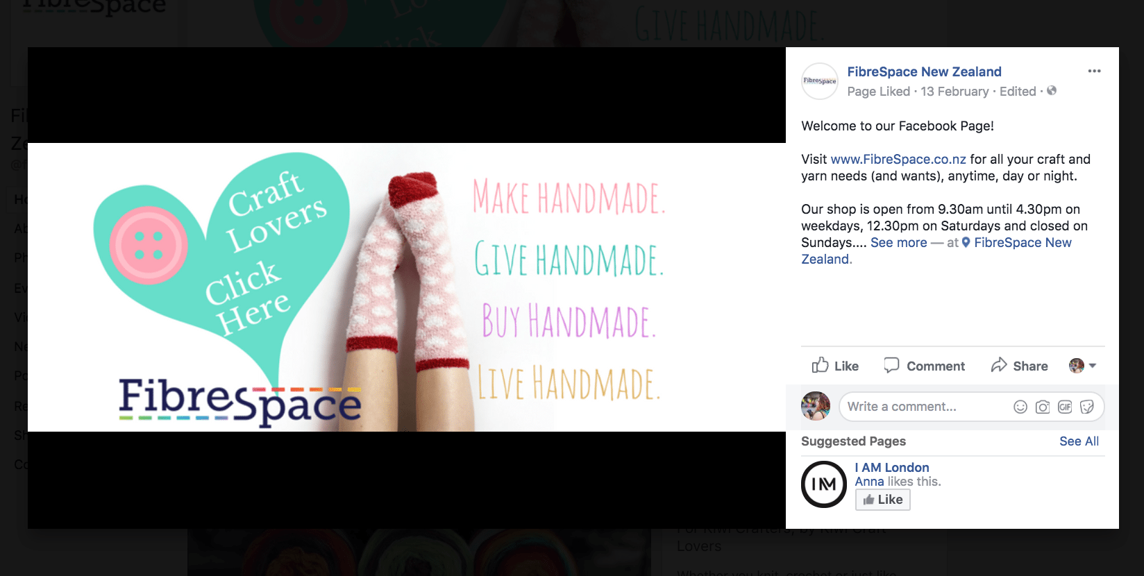
For example, a Kiwi craft and yarn store has a cover photo supporting handmade, with a picture of woollen socks. You know immediately who the page is good for and whether you identify with the brand. Important details are in the caption, including website, opening hours and phone number, so when people click on the photo, they have all the information about the store they need – that isn’t an accident!
The other is to push your latest products or promotions. Include a call to action – similar to the first banner on your website. Again, fill the caption with useful stuff for your potential customers, to make it super easy for them to follow your CTA.
In the below example, people are being called to reserve their favourite colour notebook in a pre sale, but it could just as easily be a call to join your course or follow a sale. Notice the link to click is in the second paragraph. This is important for impatient customers – the link is available without anyone having to click on “read more”.
I believe your cover photo should change often, in line with whatever campaign you’re pushing at that moment in time. I will sometimes pin the post to the top of the page, too, as that shows off the caption without anyone having to click on the photo.
The key is to use this space as a clickable billboard.
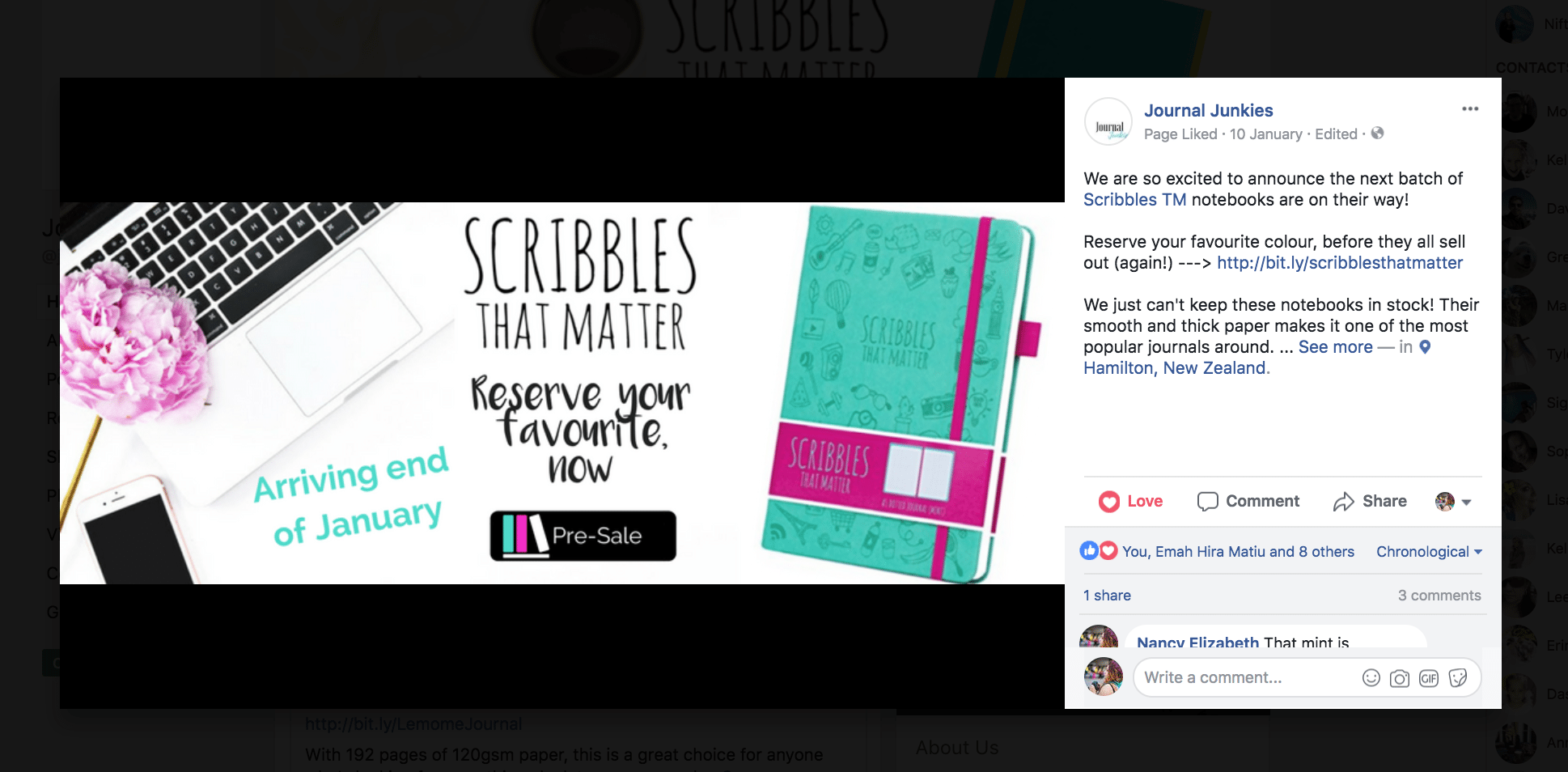
For tips on cover photo dimensions and crops on mobile and desktop, read this handy, dandy blog post (Includes free cheatsheet).

Write your Facebook Business Page story
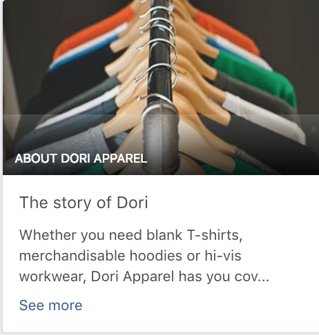
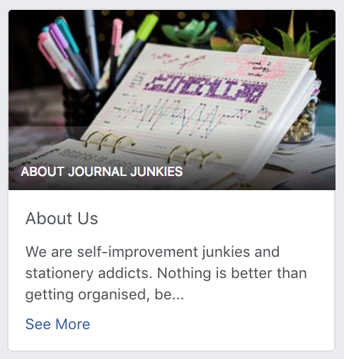
Ever noticed how Facebook rewards people who try their newest things? Well, the “About us” story section on Facebook is a relatively new thing that most Business Pages haven’t take advantage of yet!
Not only can you use the space to tell a little about yourself, you can include links, photos and important information, such as your phone number and opening hours.
It’s formatted really nicely on both mobile and desktop, and allows your potential customers to get to know a little more about you without having to leave Facebook (Facebook likes this).
Use a photo that represents your products – you’ve already got your logo and latest promotion in your profile and cover photos, so this photo just has to be attractive and on brand! Don’t put any text or anything on it, just let it speak for itself.

Create product listings on Facebook
People hate being sold to, don’t they? If only there was a way to show off your products on Facebook without making “salesy” Facebook posts…
Wait, there is and it’s been right under everyone’s noses this whole time!
Facebook allows you to list your products online – and no, you don’t need to take payment through Facebook or set up anything too fancy. You just need a good picture that works on a small scale, price, description and a link to where they can buy it (psst.. your website). It’s so simple, I can’t believe how more people aren’t doing this.
“Yeah, but Nancy, no one comes to my Facebook Page to shop…” I hear you mutter.
Did you know, not only do you get a “shop” section on your Facebook page with these products (which can also be divided into categories), you can choose to show off some of your product listings on your page, as well as – and here’s the best bit, guys – tag them in posts!
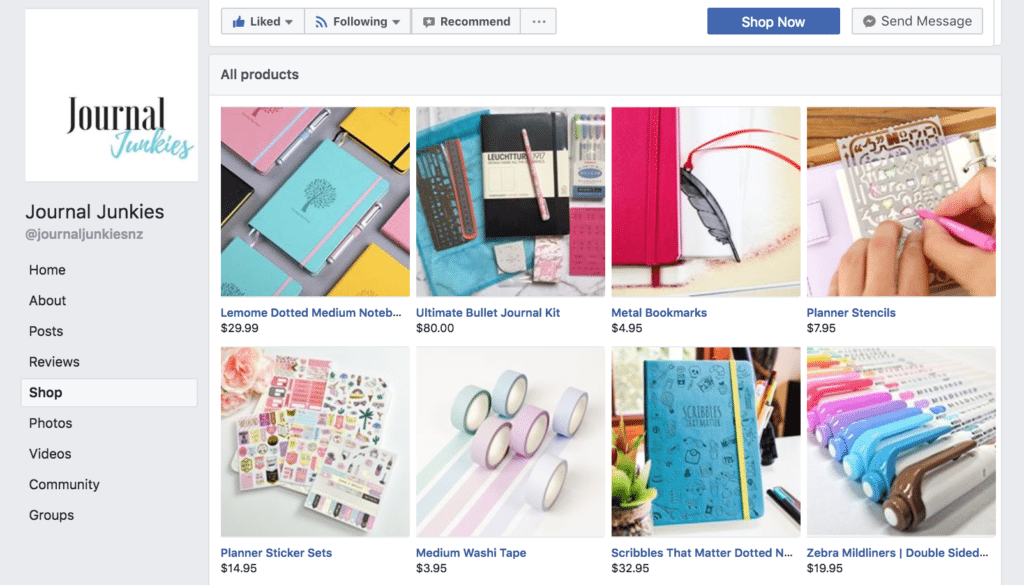
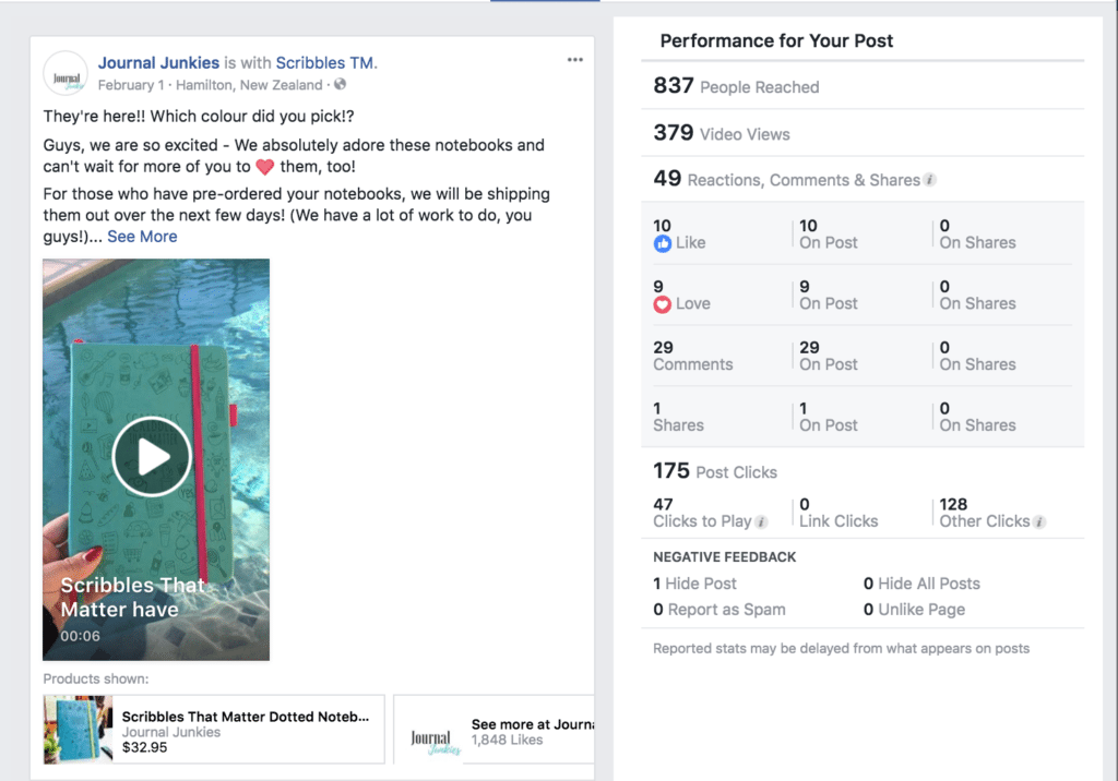
This means that if you craft a fantastic Facebook post that gains a wide reach, you’ve also got your product – and it’s price – in front of all those people even if your post isn’t directly selling anything!
Learn how to craft an engaging Facebook post and grow your organic reach, here.
It’s like adding on adverts to the bottom of newspaper articles. If the article is good, people will read it, but how awesome would it be if all those readers were exposed to your products, too?
I seriously don’t understand why more people aren’t doing this…
As much as people love to complain about Facebook, they really offer lots of advertising space absolutely free! It’s up to you to maximise the impact your own Facebook Business Page has on potential customers and fans.
The things to check and update are:
1. Facebook page name and handle
2. Profile picture
3. Cover Photo
4. About you section
5. Shop
To make it even easier, I’ve made a downloadable worksheet to go with this blog post – it even includes a post audit, which I recommend you complete every week to get a really good idea of how your page’s posts are performing.
If this is all a bit too overwhelming, join one of my online courses and I’ll personally guide you through it all, step-by-step!
