
Facebook loves making our lives difficult, doesn’t it?
At the end of 2017, everyone’s cover photos – that we’d lovingly spent ages making perfect, am I right? – started to appear warped and cut off. Facebook’s own dimension suggestions weren’t working and we all became frustrated that such a massively important space for representing our businesses and personalities, simply wasn’t working how we wanted them to.
It turned out, as it always does, to be Facebook update that just made everything appear out of whack for a while.
Luckily, the image dimensions have stabilised (for now) but, to add insult to injury, the same cover photos are cropped completely differently on mobile and desktop! How on earth are we supposed to keep up?
Want some support, feedback and your own business-squad to bounce ideas off? Join our Women’s Business Accelerator ???? For Female Entrepreneurs Who Hustle.
I’m here to help!
I’ve personally gone through each of my groups, pages and my own profile to compare the difference in how your cover photos appear on mobile and desktop.
As for canvas size, the easiest thing is to make all your cover photos 1920px x 1080px or 16:9, paying special attention to the crops and positioning important stuff in the centre (sorry to all the asymmetry lovers out there!). I have also included the sizes I’ve used in the examples below, if you want to get fancy!
Let’s take a look at our profile cover pics: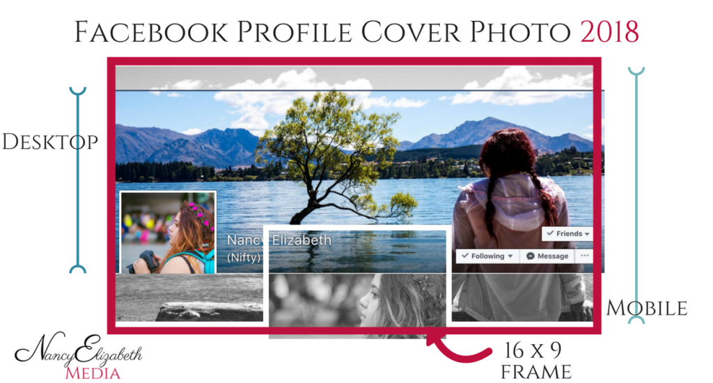
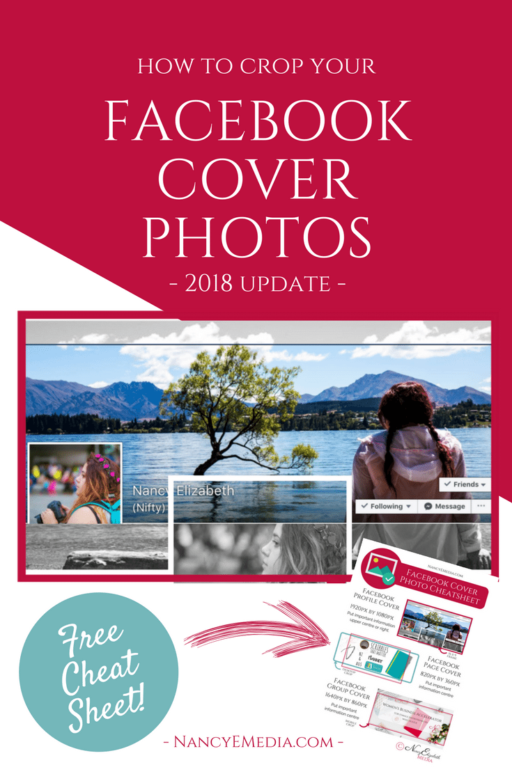
As you can see, the same image is cropped completely differently on mobile and desktop.
Not only that, but note where the profile picture overlaps the image on both sizes, too? So make sure that anything important is in the upper centre area, or to the right. Luckily, our widths appear to be the same so that makes things a little simpler…
Unlike the Facebook page cover photo:
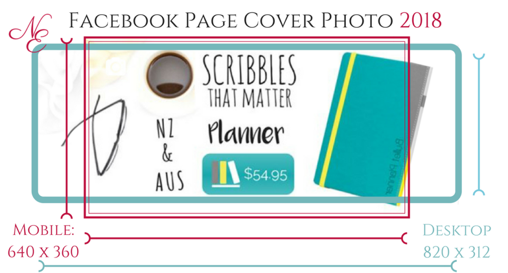
I sense your confusion and frustration, I feel it, too.
The above is an example of a 820 x 360px photo, used for one of my Facebook page cover photos, and how it’s cropped.
Again, make sure your important information is in the centre – don’t put anything important around the edges and ALWAYS check to see how it appears on both mobile and desktop.
Because…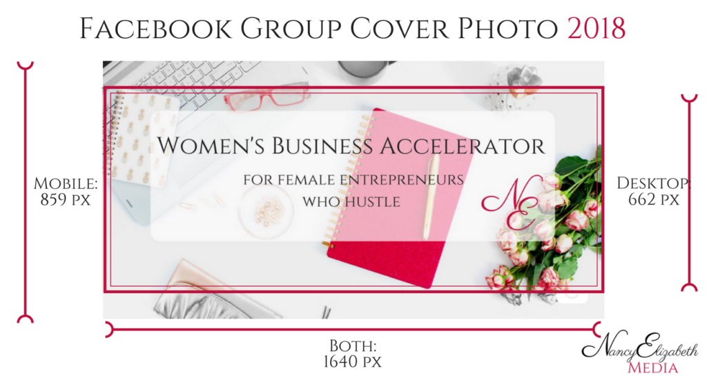
Man, the team at Facebook must think they’re pretty funny. Why we can’t make one cover photo that we can use across all our Facebook platforms is a mystery, but there you go.
The group crop isn’t as bad as the others, but you’ve still got to remember the important-stuff-centre rule.
If you’re interested, this was made on a 1640px x 860px canvas.

Facebook is a pain, that’s for sure. They’re never going to make things easy and, I think, they do this sort of thing on purpose so that people only look good on their platform if they work for it. For you, that means making different cover photos for your profile, pages AND groups…
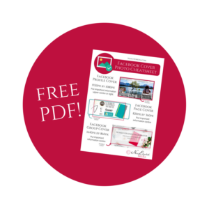
Remember, keep all the important stuff in the centre and you’ll be fine.If you update cover photos often and want something super easy to reference, download this handy cheat sheet and keep it available on your desktop!
If this is all a bit too overwhelming, join one of my online courses and I’ll personally guide you through it all, step-by-step!


Thank you for this post. It really helped since Facebook is being super difficult with cover photos!